
UPDATE: See a newer, larger version of the map here.
Over the last few years, there has been increasing commentary on the growth of tribalism within the evangelical church. For example, in early 2016, CNN ran an article entitled “7 types of evangelicals – and how they’ll affect the presidential race.” Within each of these groups, it named specific pastors and Christian leaders including Russell Moore, Tim Keller, and Jim Wallis and speculated about how they were likely to vote in the 2016 presidential race. Numerous other articles followed, including David Robinson’s “How Michael Curry’s sermon revealed the 4 tribes of evangelicals” at Christian Today, Michael Graham’s “The Six Way Fracturing of Evangelicalism” at Mere Orthodoxy, Timothy Dalrymple’s “The Splintering of the Evangelical Soul” at Christianity Today and Peter Wehner’s “The Evangelical Church is Breaking Apart” at The Atlantic. These latter articles are significant because they were all written by evangelicals who believe that evangelicalism, like the culture itself, is dividing into warring “tribes.”
Against this backdrop, I decided to ask whether any of these purported “tribes” is discernable on Twitter. Of course, handling the voluminous public data produced by social media is complicated. How does one identify supposed “evangelical tribes” when sociologists routinely argue about the very definition of the term “evangelical”? Is it meaningful to search for terms like “anti-woke” or “progressive” or “MAGA” or “BLM” in a person’s Twitter bio, when the vast majority of people don’t include these descriptors and some may even use them ironically? And wouldn’t our choice of which terms to include and exclude bias the results?
To avoid some of these problems, I decided to opt for an extremely simple, ideologically-neutral metric: follower overlap. Twitter makes a list of everyone’s followers publicly available (indeed, you can see it manually if you simply click “Followers” on someone’s profile page.) Consequently, it’s easy to find out how many “mutual followers” any two accounts have. For example, I have around 26.5k followers and my collaborator Dr. Pat Sawyer has around 3.6k followers. However, there are also 2.9k people who are our “mutual followers” because they follow both Pat and me.
Using the number of followers shared by various accounts, I constructed several maps of “evangelical Twitter,” the largest of which is shown in the next section. Keep in mind that the only measure used to create this map was “mutual followers.” You aren’t looking at a map of theology or Enneagram score or favorite Disney princess. You aren’t looking at a map of “heretics” and “non-heretics.” You aren’t looking a map of “conservatives” and “progressives.” You are merely looking at the output of an algorithm showing which accounts had high numbers of followers in common. That’s it.
In the following sections, I’ll first present the map and explain how it should be read. Next, I’ll answer some frequently asked questions, including “why are you doing this?” and “what if people misuse this information?” Finally, in the addendum, I’ll provide the mathematical details of my algorithm for fellow nerds.
The Map
Without further ado, here’s the map (right-click and open the figure in a new tab to enlarge).
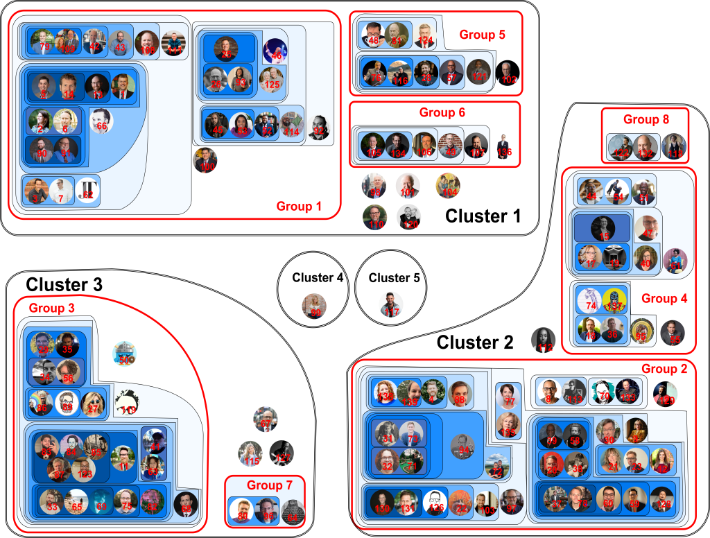
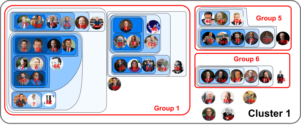
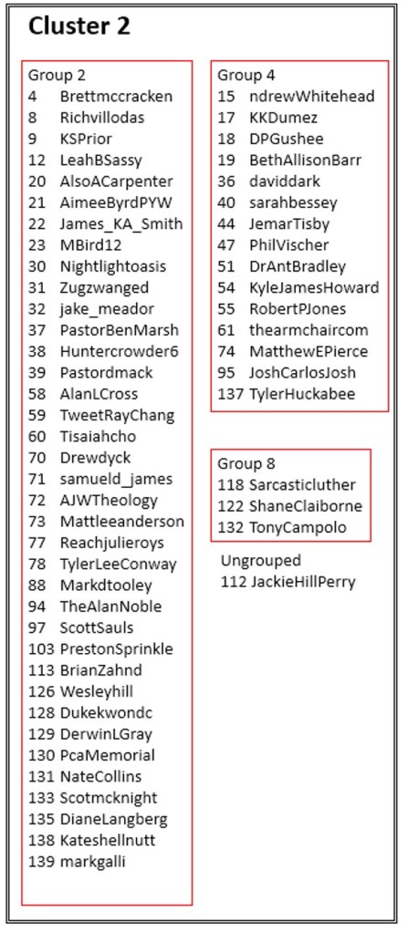
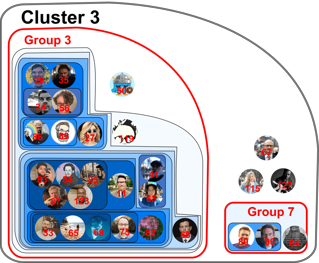
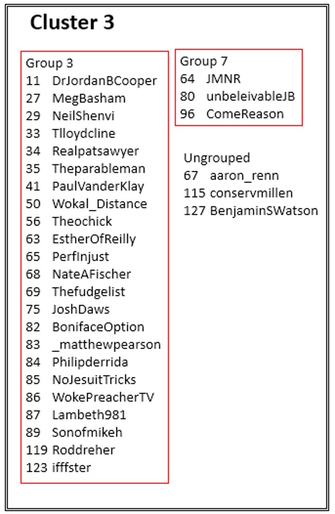
For ease of viewing, here are clusters 1-3 pictured individually, along with their legends.
Cluster 1 map:
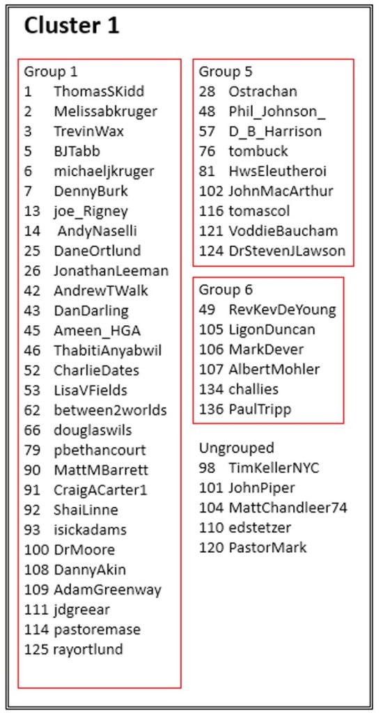
Cluster 1 legend:
Cluster 2 map:
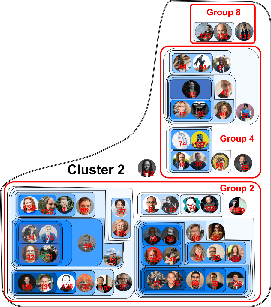
Cluster 2 legend:
Cluster 3 map
Cluster 3 legend:
Cluster 4 consists of Beth Moore and no other accounts while Cluster 5 consists of Steven Furtick and no other accounts.
If it’s difficult to see detail, the Powerpoint version is available here:
Reading the Map
Altogether, the map displays 139 Twitter accounts of evangelical Twitter users. These accounts were used to generate a data set of 3,945,030 unique Twitter users who followed at least one of these accounts. Of this total, 1,383,053 users followed two or more of the accounts on our list. All this data was used to calculate whether accounts were positively or negatively correlated. In other words, if a user in the dataset follows account A are they more likely or less likely to follow account B? The color of the region of a map shows how strongly the accounts in that region are correlated. The darker the color, the stronger the positive correlation.
Another way to think about this figure is as a kind of contour map. People who are connected most strongly by mutual followers are like the “peaks” on the map (indicated by regions of darker color.) Then as you “descend” from those peaks, the contour lines include more and more people within a particular group. My choice of which “contour line” to call a “group” is arbitrary and merely makes it easier to produce a written legend for readers who don’t immediately recognize people’s Twitter profile pictures. On the other hand, the “clusters” on the map are the final result of the algorithm. They represent collections of accounts which are negatively associated, such that a user in the dataset who follows an account in -say- Cluster 1 is less likely to follow an account in -say- Cluster 3.
Let me provide a few examples to clarify.
In Cluster 1/Group 1, we see that accounts 2 and 6 are in a dark blue region, indicating that users who follow account 2 are more likely to follow account 6. If we consult the legend, we see that account 2 corresponds to Melissa Kruger while account 6 corresponds to Michael Kruger, her husband. Nearby, we also notice that accounts 90 and 91 are strongly linked. The legend tells us that account 90 belongs to Prof. Matt M. Barrett while account 91 belongs to Prof. Craig A. Carter, both of whom have written books on the Trinity and are Credo Fellows who write for Credo Magazine. Of course, the algorithm didn’t know any of this information, but these connections were expressed in the significant overlap between these accounts’ Twitter followers.
I encourage readers to pore over the map and see if they can find any other interesting and possibly subtle connections.
Let’s try another example. Steven Furtick (account 117) is alone in his own cluster (Cluster 5.) The clusters are defined by the algorithm such that if a user in our dataset follows an account in one cluster, it makes him less likely to follow an account in a different cluster (and vice versa). So, for example, if a user follows Steven Furtick, he is less likely to follow someone from Cluster 1, 2, 3, or 4. In fact, if I consult the data, there is a particularly strong negative correlation between Cluster 3 and Cluster 5 of R_{35} = 0.175 (see below for details on this notation). What this means is that if a user follows Furtick he is nearly 6 times less likely to follow someone in cluster 3 and vice versa.
One final note: while the categorization of the accounts into various groups, subgroups, and clusters is important and is output by the algorithm, their spatial positioning is not. In other words, I made arbitrary decisions to put Cluster 3 in the lower left corner of the map or to place Group 8 above Group 4. So there is no significance whatsoever in where the accounts are placed, provided that we don’t move them into or out of different regions bounded by solid lines.
Frequently Asked Questions
Why are you doing this?”
I became particularly interested in social media data in December after sociologist Ryan Burge showed that usage of the term “Bulverism” had risen sharply on Twitter over the last few years. I wanted to do the same analysis with words like “white privilege” and “intersectionality” (following the analysis that graduate student Zach Goldberg had done on the NYTimes), so I began learning a language called “R” which can be used to query Twitter. Unfortunately, you have to pay for access to certain data, so –in the process of learning the language– I began investigating other projects that could be done using free, publicly accessible data. Drawing a map of evangelical Twitter struck me as an interesting project, especially after having read so much (and observed so much) about the emerging “tribes” of evangelicalism.
“Isn’t this divisive?”
The simplest response to this question is to ask: “do you think the numerous articles posted in the first paragraph of this article are also divisive?” Obviously, evangelicals do disagree on matters ranging from politics to denominational affiliation to theology. Simply pointing out that such disagreements exist does not create those disagreements nor does it encourage (or discourage) those disagreements.
That said, all the articles I posted above have one thing in common: they’re purely qualitative. None of them attempt to support their conclusions with quantitative data. It seems strange to laud these articles as thought-provoking and beneficial and then to condemn my attempt to discern the existence of these “tribes” on the basis of actual data!
But more importantly, there have been dozens of articles that not only identify and describe certain tribes within evangelism, but actively condemn them. Entire books have been written about how “white evangelicalism” and “Christian patriarchy” and “Christian nationalists” are corrupting Christianity and threatening democracy. It seems extremely inconsistent to view these books as acceptable and even crucially important while viewing a purely descriptive project that makes no value judgments at all as “divisive.”
“What if people misuse this information?”
There’s no question that people can misuse this information in various ways. However, the same can be said of nearly everything ever said or written. Paul rebuked the Corinthians for using (true!) theology to puff themselves up and to disparage others. Yet he didn’t stop teaching theology. Similarly, when I write either positive or negative book reviews, people sometimes use these reviews to disparage me or to disparage the book’s author. But if my review is fair and accurate, the responsibility for this misuse of my work does not fall on me.
And, oddly enough, different people use my map in completely contradictory ways. For example, I’ve seen people say “now I know who to follow” or “now I know who to block” or “now I know who the heretics are” or “now I know who’s orthodox” even though they’re all referring to the same groups of people. In other words, their reactions tell us far more about their own beliefs than they tell us about the data.
“So does this map reveal ‘tribes’ within evangelicalism?”
Given the consistency of particular clusters over the last four iterations of my map, I would cautiously say “yes.” The raw, mutual-follower data shows correlations between peoples’ followers that would be astronomically unlikely due to chance alone. Moreover, these correlations are also correlated. For example, even if we assume that people who follow account A are more likely to follow accounts B and C, we still find that the number who follow all three accounts are far more than we expect due to random chance alone.
Conversely, there are other accounts that are strongly anti-correlated, meaning that if you follow account A you are significantly less likely to follow account B. All of these observations support (although they don’t prove) the idea that there really are “tribes” within evangelicalism.
Furthermore, the clusters do seem to include some ideological component. For example, it would take a lot of work to convince me that Owen Strachan and Voddie Baucham are so closely connected merely because they are both Baptists and not also because they are both well-known critics of Critical Race Theory. Likewise, I doubt that Kristin Kobes Du Kez and Beth Allison Barr are so closely connected merely because they are both historians and not also because they both recently published popular books critiquing complementarian theology.
That said, even these conclusions are tentative. It would be fairly easy to test the existence and (partly) ideological nature of these clusters by applying other, independent tests involving the number of intra/inter-cluster likes/retweets, the information contained in followers’ bios, the density of intra/inter-cluster follower relationships, etc… But given the firestorm that my wholly neutral, non-ideological map generated, I’m not overly-inclined to probe this issue too much (at least, not publicly).
For now, I would use this map as a kind of diagnostic for your media consumption. If you’re on Twitter, take a look at the people you follow. And even if you’re not, think about the podcasts you listen to, the sermons you download, and the blogs you read. If all your media intake comes from sources narrowly located within a single cluster, you’re probably living in an echo chamber. Consider adding a few people from other clusters to diversify your feed. One of the repeated themes of my writing and talks is the need for dialogue. We should try to be well-informed of other people’s views and perspectives, even if we end up disagreeing with them.
Casual readers are welcome to ask me questions on Twitter at @NeilShenvi. If data scientists have comments, criticism, or suggestions for future work, I likewise welcome feedback.
Related articles:
- Villains, Victims, and Visionaries: Three Books for Understanding Our Culture
- Madness and Its Discontents – A Short Review of Murray’s Madness of Crowds
- A Short Review of Haidt’s The Righteous Mind
Addendum: Mathematical Details for Nerds
To understand my algorithm, let me first define a few terms. I’ll define a “user” to refer to any Twitter user while I’ll use the term “account” to refer to an individual who will end up on the map we finally produce. The “footprint” of an “account” is the set of all users who follow that account. So the footprint of the account “A” would refer to the set of all users who follow A. We’ll let S_A refer to the size of the footprint of A (e.g. the number of users who follow A).
A set of accounts can also have a footprint. So, for example, the footprint of the accounts “A” and “B” would refer to all the users who follow either “A” or “B.” We’ll let S_{AB} refer to the size of the footprint of A and B (e.g. the number of users who either follow A or B). Note that the S_{AB} will be less than or equal to S_A + S_B because some users follow both accounts and shouldn’t be double-counted. A user who follows two or more accounts is a “mutual follower” of these accounts.
We begin the mapping process by selecting some set of N accounts we would like to place on our map. We’ll call the footprint of all these accounts our “universe,” whose size is S_universe
Given this terminology, we’re ready to understand my clustering algorithm. We first query Twitter for all the users who follow the N selected accounts. We throw out duplicate users to obtain the unique set which constitutes our “universe.” We can then use the size of this universe to calculate the expected number of mutual followers that any two accounts would have if there were no correlation between which accounts users follow.
For example, let’s say that there are 1M Twitter users in our universe. If we consider two accounts “A” and “B” such that S_A = 10,000 and S_B = 5,000 then 1.0% of our universe follows A and 0.5% follows B. If members of our universe followed people entirely at random, we’d expect that 10% * 0.5% = 0.05% of our universe (or roughly 50 people) would follow both A and B. In other words, the number of “expected mutual followers” of A and B is 50. However, we can compare this expected number of mutual followers to the actual number of mutual followers, which can be obtained from the follower lists of A and B.
Following this approach, we let R_{AB} equal the ratio of actual mutual followers of accounts A and B to expected followers of accounts A and B. In our previous example, if accounts A and B actually had 75 mutual followers then R_{AB} would be 75/50 = 1.5. Alternatively, if accounts A and B actually had 25 mutual followers then R_{AB} would be 25/50 = 0.5. When R_{AB} > 1, then there are more mutual followers than expected from chance alone. When R_{AB} < 1, then there are fewer mutual followers than what’s expected from chance alone. Evaluating all these ratios yields an N x N positive, symmetric matrix R_{xy} where x and y each represent one of our N accounts.
With this matrix in hand, we can begin building clusters using a “greedy” algorithm that coalesces clusters step by step. The key insight is that we can treat a cluster of accounts as its own aggregate account which has the same footprint as the accounts that are a part of it. For example, if our algorithm generates a cluster 1 containing accounts A, B, and C, then the footprint of cluster 1 will simply consist of all the followers of A, B, or C. We can still calculate mutual followers of cluster 1 and account D, which will be the number of users who follow {A or B or C} and D. In other words, once we create clusters, they behave exactly the way that normal accounts do. Consequently, our algorithm follows these steps:
- Let N_C be the number of current clusters. Set N_C = N and initialize each cluster to contain a single account. e.g. cluster 1 contains only account A, cluster 2 contains only account B, cluster 3 contains only account C, etc…
- Calculate the N_C x N_C ratio matrix R_{ij} between each cluster i and j.
- Find the maximum value of R_{ij}.
- Merge cluster i and cluster j into a single new cluster k.
- Define cluster k to include all the accounts in cluster i and all the accounts in cluster j
- Calculate the footprint of k, which encompasses all users who are in the footprint of cluster i or the footprint of cluster j.
- Set N_C to N_C-1
- Recalculate the ratio matrix R_ij. If R_ij are all < 1, end. Otherwise, return to step 3.
This algorithm produces a final set of clusters such that the number of users who are mutual followers of any two clusters i and j are less than or equal to 1, i.e. less than or equal to what we’d expect from chance alone. However, it also produces a sequence of steps leading up to the result, so that we can see at each point which accounts are connected. Accounts that are connected early in this process are more “tightly bound” than those connected towards the end. Visually, we can place these “early” clusters at the “peaks” on our map, represented by dark colors. Later, larger clusters are represented by lighter colors.
Finally, it’s always possible to stop the algorithm “early” (when some R_ij values are still > 1) or to push it “late” (i.e. to continue to coalesce the clusters even though all of the R_ij values are < 1). This makes it possible to obtain any particular number of clusters desired.
Like any clustering algorithm, this one has pluses and minuses, a few of which I enumerate below.
First, treating clusters as if they are aggregate accounts prevents a few small, highly-connected accounts from obscuring the underlying structure of the universe. For example, we can imagine a set of N-1 large accounts that clearly fall into two, entirely disconnected clusters. However, we could imagine an Nth account with a single follower who also followed every one of the larger accounts. Thus, there would be one mutual follower between the tiny account and every other account. Consequently, the R value between the tiny account and each large account would be extremely high and a naive algorithm might then condense all the accounts into a single cluster. My algorithm avoids this problem because once the tiny account is connected to a single large account, the new aggregate account behaves normally.
Second, my approach “answers” the question “what is evangelical Twitter?” without directly addressing “who qualifies as an evangelical?” For the purposes of my algorithm, the footprint of all the N selected accounts, i.e. the “universe”, is treated as “evangelical Twitter.” To put it another way, the algorithm focuses on mapping the N accounts given to it. If these accounts all belong to evangelicals (however we define the term), then we are, in some sense mapping a region of “evangelical Twitter” even if our map may be incomplete because we’ve neglected certain individuals who “ought” to be there.
Third, I’d suggest that very large ones may not be useful to my approach for two reasons. One obvious problem is that I might follow a “big account” like Elon Musk or Jack Dorsey simply because they are famous, not because I agree with anything they say. I might even “hate-follow” an account precisely because I disagree with it and want to post snarky memes on its timeline every five minutes (this is Twitter after all). On the other hand, my intuition is that far fewer people follow some relatively unknown seminary professor or a small-town pastor to rage-Tweet about his daily Bible verse. Of course, it’s hard to know what the map means when the accounts belong to people you’ve never heard of. Consequently, accounts between 5k-10k and high “follower to following” ratios may be optimal. These would presumably be large enough to have name recognition, but not large enough to attract large numbers of random followers.
Another problem is that large accounts usually contain a lot of “singletons,” meaning users who are only part of a single account’s footprint. For example, many people follow David French not because they’re evangelicals, but because he’s a well-known public figure. As a result, these users are unlikely to follow any other evangelical accounts. Because our algorithm runs entirely on “mutual followers,” these singletons are dead weight; they merely drag an account’s R_{ab} numbers down. As a result, big accounts often end up isolated in their own cluster entirely or don’t join larger clusters until the algorithm is almost complete. There are ways to avoid this behavior, but it’s entirely correct from the algorithm’s perspective: the fact that a user follows David French is just not a strong predictor of whether that user will follow some other evangelical.
Finally, many clustering algorithms exist and mine is certainly not the only one or even the best one. In the future, I’d implement other, more complex algorithms to see if they produce similar results. In general, I expect that the strongly connected accounts (dark colors) will likely remain connected with the more loosely connected accounts (light colors) may shift from group to group and even from cluster to cluster based on which algorithm we use. The input data itself (the account overlaps) will not change, but the way we process this data (the clustering algorithm) will affect the output. I also plan on applying this approach to other Twitter subcommunities like “emergency medicine Twitter,” “math Twitter,” and “chemistry Twitter.”
And yes, I will eventually make all the code public, either here or on github.
