A few weeks ago, I began building increasingly large and detailed maps of “evangelical Twitter.” In a previous article, I explained my reasons for doing so:
Over the last few years, there has been increasing commentary on the growth of tribalism within the evangelical church…. Against this backdrop, I decided to ask whether any of these purported “tribes” is discernable on Twitter. Of course, handling the voluminous public data produced by social media is complicated. How does one identify supposed “evangelical tribes” when sociologists routinely argue about the very definition of the term “evangelical”? Is it meaningful to search for terms like “anti-woke” or “progressive” or “MAGA” or “BLM” in a person’s Twitter bio, when the vast majority of people don’t include these descriptors and some may even use them ironically? And wouldn’t our choice of which terms to include and exclude bias the results?
In this article, I’ll mainly present my latest map along with some additional, independent data that validates my approach. In its current form, the map incorporates data from 182 “evangelical Twitter” accounts followed by 4,667,437 unique Twitter users.
While I’ll keep the mathematical details to a minimum, the current version of the map was based on the recognition that each Twitter account on the map has a “fingerprint” corresponding to the number of mutual followers it shares with all the other accounts on the map. My algorithm then used the accounts’ fingerprints to group accounts which had similar fingerprints. For example, compared to what we’d expect from random chance alone, my account had far more mutual followers with MegBasham, WokePreacherClips, and SonOfMikeh and far fewer mutual followers with BethMooreLPM, StevenFurtick, and Sojourners. Thus my account was grouped with other accounts which also had far more mutual followers with MegBasham, WokePreacherClips, and SonOfMikeh and far fewer mutual followers with BethMooreLPM, StevenFurtick, and Sojourners.
The final result shown below should be read like a “contour map.” Accounts in the dark blue regions are like “mountain peaks” and correspond to accounts whose fingerprints are very similar. Then as you “descend” from those peaks, the contour lines surrounding lighter-colored regions include people whose fingerprints are less and less similar.
In the end, the algorithm detected 3 different “Clusters” of accounts (labelled “A”, “B”, and “C”), each of which showed notably different “fingerprints.” Additionally, to make it easier to read the map, I identified 10 different “Groups” of accounts (labelled 1 through 10) whose fingerprints also resembled one another even more strongly.
Without further ado, here is Evangelical Twitter map #5. Click here for larger, high-quality version.
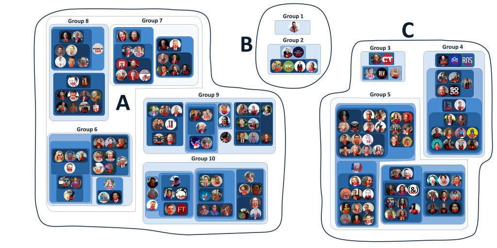
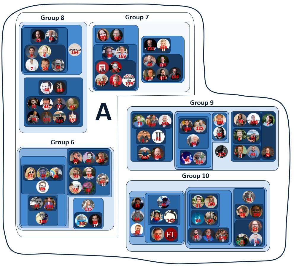
Here is an expanded view of Cluster A (Figure 2) along with a list of the accounts:
Cluster A:
Group 6: #27 MegBasham, #29 NeilShenvi, #33 tlloydcline, #34 realpatsawyer, #50 Wokal_Distance, #68 NateAFischer, #65 PerfInjust, #67 aaron_renn, #75 JoshDaws, #82 BonifaceOption, #83 _matthewpearson, #84 philipderrida, #86 WokePreacherTV, #87 lambeth981, #89 sonofmikeh, #115 conservmillen, #144 Ptr_StephenFein, #180 therealmoniqued
Group 7: #49 RevKevDeYoung, #96 ComeReason, #102 JohnMacArthur, #105 LigonDuncan, #106 MarkDever, #107 AlbertMohler, #124 DrStevenJLawson, #134 challies, #169 RFupdates, #170 STRtweets, #171 DrFrankTurek, #172 jwarnerwallace, #173 Sean_McDowell, #179 OneMinApologist, #181 Natasha_Crain, #182 DrMichaelLBrown
Group 8: #5 BJTabb, #6 michaeljkruger, #7 DennyBurk, #13 joe_rigney, #14 AndyNaselli, #26 JonathanLeeman, #28 Ostrachan, #42 AndrewTWalk, #48 Phil_Johnson_, #57 D_B_Harrison, #66 douglaswils, #76 tombuck, #81 HwsEleutheroi, #116 tomascol, #121 VoddieBaucham, #157 FoundersMin, #163 canonpress, #164 WNGdotorg
Group 9: #1 ThomasSKidd, #2 melissabkruger, #3 TrevinWax, #4 brettmccracken, #25 DaneOrtlund, #43 DanDarling, #46 ThabitiAnyabwil, #62 between2worlds, #72 AJWTheology, #79 pbethancourt, #92 ShaiLinne, #93 isickadams, #98 TimKellernyc, #100 DrMoore, #108 DannyAkin, #109 AdamGreenway, #111 jdgreear, #114 pastoremase, #125 rayortlund, #127 BenjaminSWatson, #145 kswhitfield, #146 ambassador215, #168 RebeccMcLaugh
Group 10: #11 DrJordanBCooper, #31 zugzwanged, #32 jake_meador, #35 theparableman, #41 PaulVanderKlay, #56 theochick, #63 EstherOfReilly, #64 JMNR, #69 thefudgelist, #71 samueld_james, #73 mattleeanderson, #80 unbelievableJB, #85 NoJesuitTricks, #88 markdtooley, #90 MattMBarrett, #91 CraigACarter1, #119 roddreher, #123 ifffster, #140 XianMind, #154 firstthingsmag, #178 DrPJWilliams
Here is an expanded view of Cluster B (Figure 3) along with a list of the accounts:
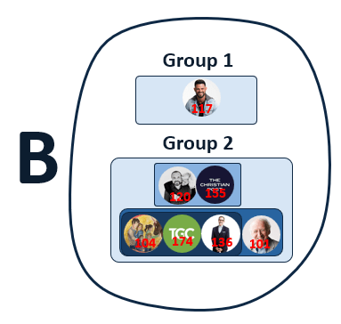
Cluster B:
Group 1: #117 SteveFurtick
Group 2: #101 JohnPiper, #104 MattChandler74, #120 PastorMark, #136 PaulTripp, #155 ChristianPost, #174 TGC
Here is an expanded view of Cluster C (Figure 4) along with a list of the accounts:
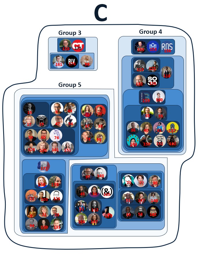
Cluster C:
Group 3: #99 BethMooreLPM, #110 edstetzer, #161 danielhill1336, #175 CTmagazine, #176 relevant
Group 4: #18 DPGushee, #36 daviddark, #40 sarahbessey, #55 RobertPJones, #61 thearmchaircom, #113 BrianZahnd, #118 Sarcasticluther, #122 ShaneClaiborne, #132 tonycampolo, #133 scotmcknight, #137 TylerHuckabee, #149 KaitlinCurtice, #150 wirelesshogan, #152 d_l_mayfield, #153 missioalliance, #156 Sojourners, #158 RNS #159 BAbridgebuilder, #160 LatashaMorrison, #162 stewartdantec
Group 5: #8 richvillodas, #9 KSPrior, #12 LeahBSassy, #15 ndrewWhitehead, #17 KKDumez, #19 BethAllisonBarr, #20 AlsoACarpenter, #21 AimeeByrdPYW, #22 James_KA_Smith, #23 MBird12, #30 nightlightoasis, #37 PastorBenMarsh, #38 huntercrowder6, #39 pastordmack, #44 JemarTisby, #45 Ameen_HGA, #47 PhilVischer, #51 DrAntBradley, #52 CharlieDates, #53 LisaVFields, #54 KyleJamesHoward, #58 AlanLCross, #59 TweetRayChang, #60 tisaiahcho, #70 drewdyck, #74 MatthewEPierce, #77 reachjulieroys, #78 TylerLeeConway, #94 TheAlanNoble, #95 JoshCarlosJosh, #97 ScottSauls, #103 PrestonSprinkle, #112 JackieHillPerry, #126 wesleyhill, #128 dukekwondc, #129 DerwinLGray, #130 PcaMemorial, #131 NateCollins, #135 DianeLangberg, #138 kateshellnutt, #139 markgalli, #141 scott_m_coley, #142 martyduren, #143 JonTyson, #147 phillipmholmes, #148 JasmineLHolmes, #151 Tish_H_Warren, #165 AndCampaign, #166 JawnO, #167 trillianewbell, #177 DavidAFrench
Validating the Map
Like all my previous maps, this one was constructed entirely based on the number of mutual followers shared by different accounts. In other words, this map incorporates no information about a person’s theology, politics, biographical information, or even their name. Consequently, one way to test whether the map is actually identifying something like different evangelical “tribes” is to compare it to other, independent data not used to build the map.
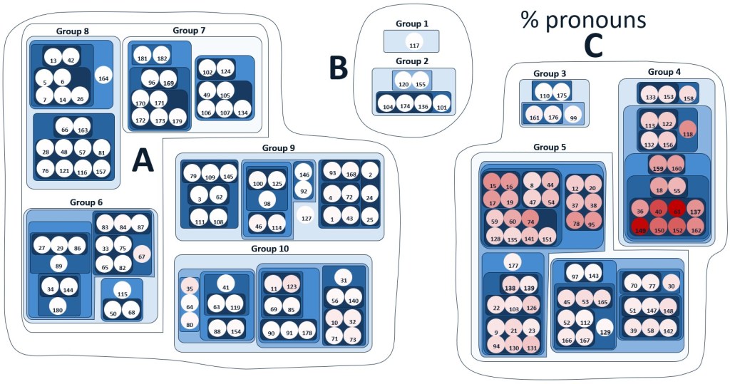
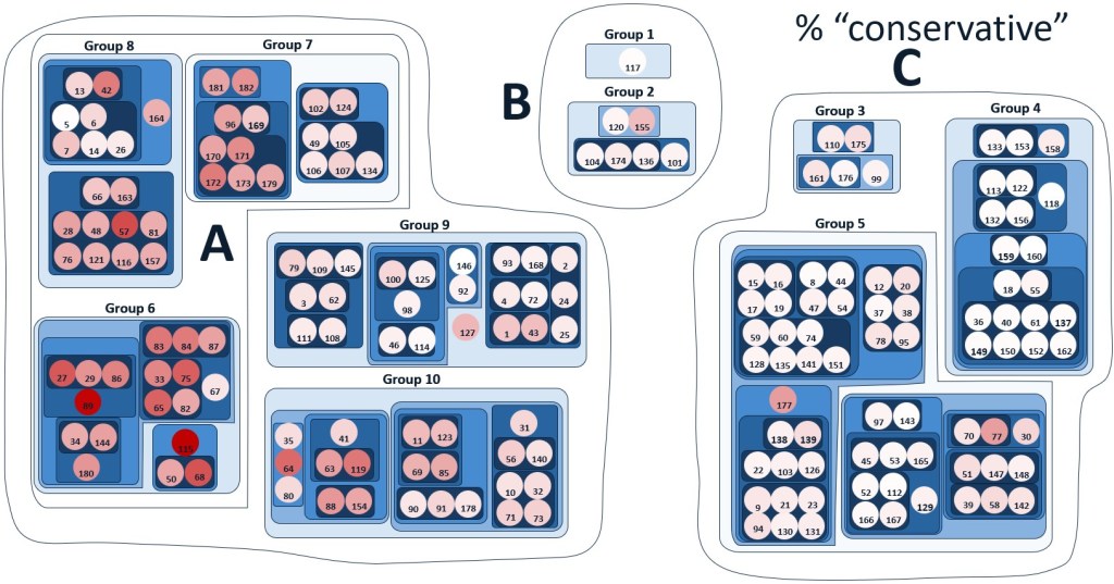
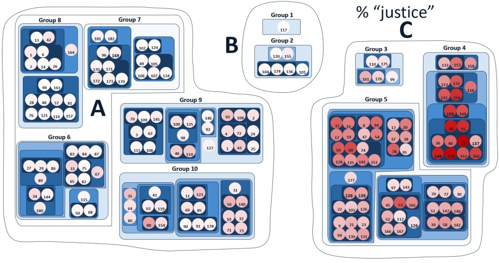
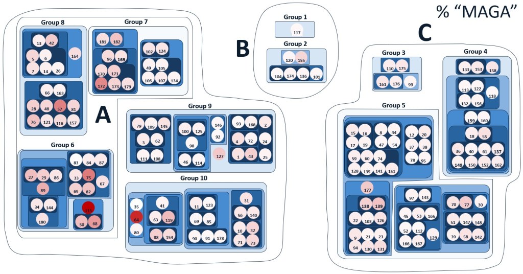
Figures 5-7 provide such confirmation. Here, I’ve generated heat maps (c.f. a red/blue U.S. presidential election map) showing the % of an account’s followers who also follow some secular media account. Figure 5 shows the results for FDRLST (The Federalist), Figure 6 shows results for Jezebel, and Figure 7 shows results for Quillette. Dark colors indicate that a high percentage of an account’s followers also followed the specified media account; light colors indicate that a low percentage of an account’s followers also followed the specified media account. If users followed these accounts entirely at random, then we wouldn’t expect to see a clear pattern on these heatmaps. However, we actually see very clear patterns for all three media accounts.
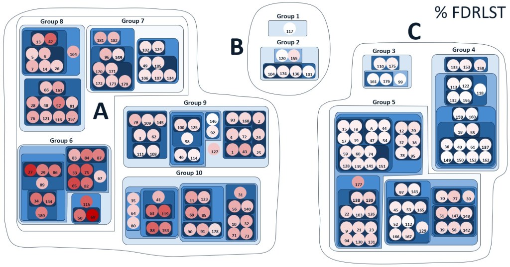
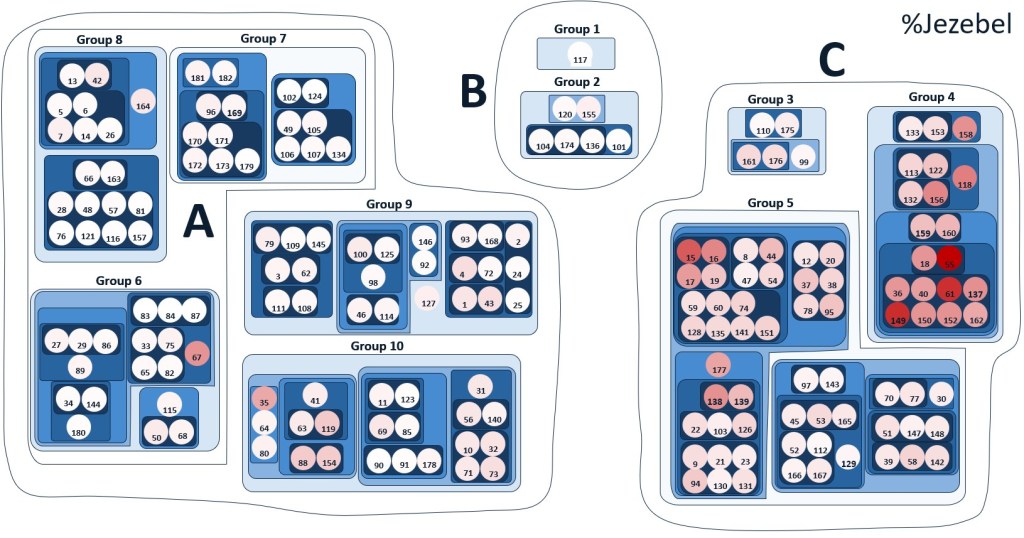
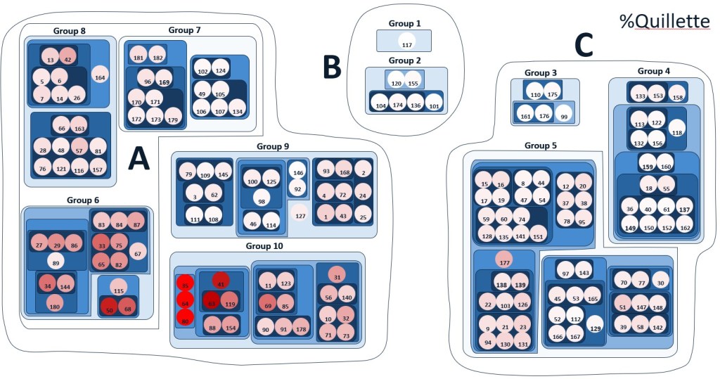
In addition to these 3 accounts, I generated data for 8 other organizations: TPUSA (Turning Point USA), DailyKos, DCExaminer, NRO (The National Review), TheGrio, Jacobin, Areo, and TPM (Talking Points Memo). Unsurprisingly, the heatmaps of these different outlets were correlated in intuitive ways. For example, TPUSA, FDRLST, NRO, and DCExaminaer are all conservative outlets and all their heatmaps were highly correlated (r > .64). Likewise, Jezebel, The Daily Kos, The Grio, Jacobin, and TPM are all progressive outsets and their heatmaps were highly correlated (r > .59). Finally, the footprints of Areo and Quillette were highly correlated (r > .95).
The take-away from all this data is that the algorithm is working properly and is grouping similar accounts while segregating dissimilar accounts.
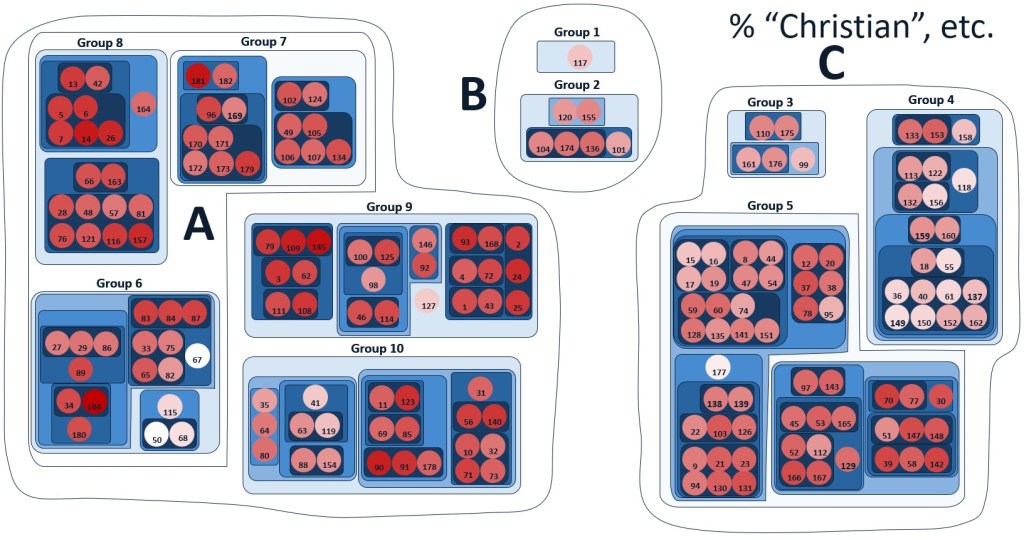
I conducted a second major, independent test by searching the Twitter bio of an account’s followers for certain keywords involving a Christian designation (“Christian,” “Jesus,” “Protestant,” “Catholic,” “Orthodox), family phrases (“husband,” “wife,” “father,” “mother,” etc.), church leadership titles (“Pastor,” “priest,” “elder”, etc.), pronouns (“he/him,” “she/her,” “they/them”), Enneagram scores, political labels (like “conservative,” “liberal,” “progressive), and ideological labels (“justice,” “MAGA,” “BLM”, “patriot”, etc.).
Figures 8-12 show heatmaps for the percentage of an accounts followers that contain: 1) a Christian designation 2) pronouns, 3) the word “conservative”, 4) the word “justice”, 5) the word “MAGA”. Results again show clear patterns that we wouldn’t expect from a purely random distribution of these phrases in Twitter users’ bios.
Finally, the similarity between this map and previous versions, which used a different clustering algorithm, should provide us with additional confidence that the map is identifying robust clusters of accounts that aren’t merely artifacts of a particular method of analysis.
As I said, I won’t offer any interpretation of this data, other than to say that it offers evidence that evangelical Twitter accounts do seem to fall into various “tribal” categories that appear to track with America’s liberal-conservative political divide. However, I’ll offer one caveat. All the data I’ve examined probes only the kinds of followers certain accounts tend to attract rather than the beliefs, theology, or ideology of the account’s owner. In theory, it’s entirely possible for an account to have followers who are -say- extremely conservative even though the accounts owner is liberal and vice versa.
I’ll conclude by simply restating what I said in my previous article:
I would use this map as a kind of diagnostic for your media consumption. If you’re on Twitter, take a look at the people you follow. And even if you’re not, think about the podcasts you listen to, the sermons you download, and the blogs you read. If all your media intake comes from sources narrowly located within a single cluster, you’re probably living in an echo chamber. Consider adding a few people from other clusters to diversify your feed. One of the repeated themes of my writing and talks is the need for dialogue. We should try to be well-informed of other people’s views and perspectives, even if we end up disagreeing with them.
Casual readers are welcome to ask me questions on Twitter at @NeilShenvi. If data scientists have comments, criticism, or suggestions for future work, I likewise welcome feedback.
Details for nerds
I’ll use the definitions and notation I developed in my previous article to explain the algorithm’s current iteration. Again, the only input to the algorithm was an N x N positive symmetric matrix R_{xy} that specified ratio of the number of mutual followers of accounts x and y divided by the number of mutual followers that would be expected if there were no correlation between accounts that users followed.
The difference in the present iteration of the algorithm is that this matrix was interpreted as providing “fingerprints” of the various accounts. For example, for a given account x, the N-vector R_{xz} is a “fingerprint” specifying the overlap of x with every other account z. Similarly, the N-vector R_{yz} is a “fingerprint” specifying the overlap of y with every other account z. Given this interpretation, we can compare R_{xz} to R_{yz} and ask how similar the two fingerprints are or, conversely, how distant they are. Because the R values varied over several orders of magnitude, I decided to use Q_{xz} = ln(R_xz) as the relevant variable such that Q_{xz} > 0 when the two accounts had more mutual followers than expected and Q_{xz} < 0 when the two accounts had fewer mutual followers than expected.
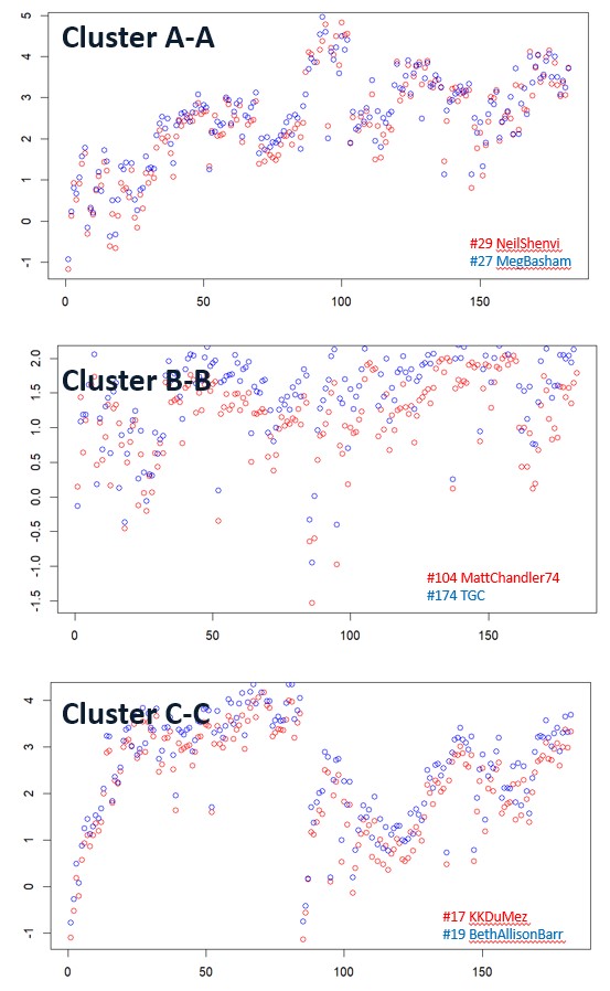
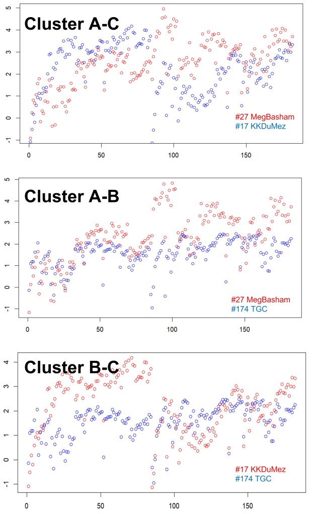
A quick glance at the data justifies this approach. Figure 13 shows the actual fingerprints of pairs of accounts from Cluster A (@MegBashan and @NeilShenvi), Cluster B (@MattChandler74 and @TGC), and Cluster C (@KKDuMez and @BethAllisonBarr). In each case, it’s clear that the “fingerprints” of the accounts within a given cluster are very similar. In contrast, Figure 14 shows the same accounts compared to account different clusters. Even to the naked eye, the differences are apparent.
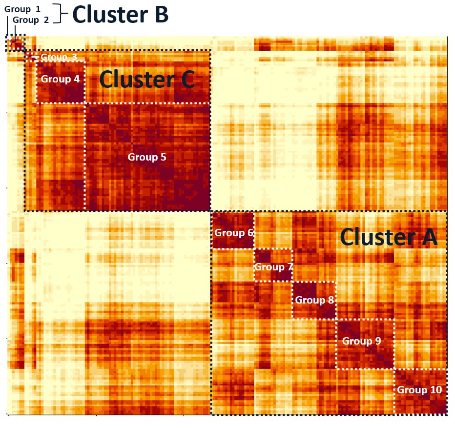
Finally, Figure 15 shows the correlation matrix (r^2 values) for the 182 accounts, along with how they are grouped by the algorithm. The different groups (and even different subgroups) identified by the algorithm are clearly visible in the matrix.
Related articles:
